Stackfix aims to help busy startups and SMB's find the right software, without hours of wasted time researching and comparing.
Ahead of our launch on Product Hunt (where we landed site of the day!) the Stackfix platform was in need of an uplift, to help it stand out amongst competitors and provide a more memorable experience.
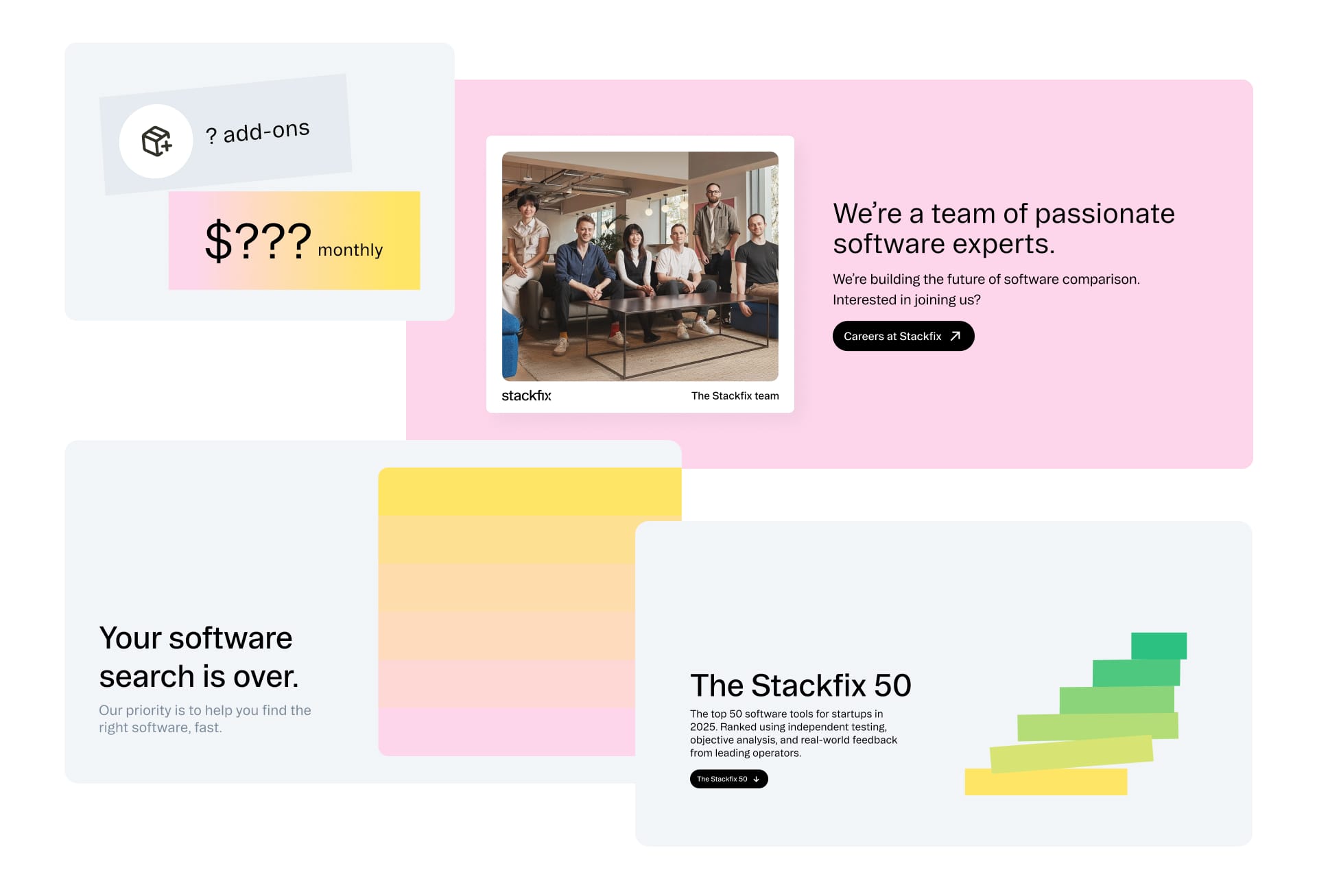
Over one week, we completely restyled the existing Stackfix platform to be more aligned with our new direction. I created a lightweight component library for delveopers to reference, ensuring consistency in this period of growth.
As a startup, our quest for product market fit was full of trial and learning. Myself and the team ran over 500 user interviews, testing usability, look and feel, and diving into deeper questions around their software journey.
This research and constant iteration helped to shape the Stackfix platform into a highly usable tool that guided users through their software buying journey.
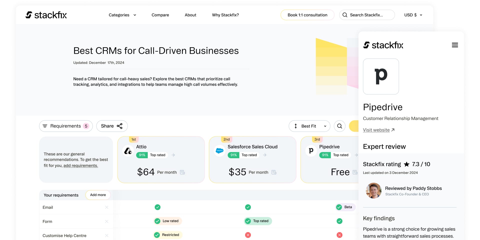
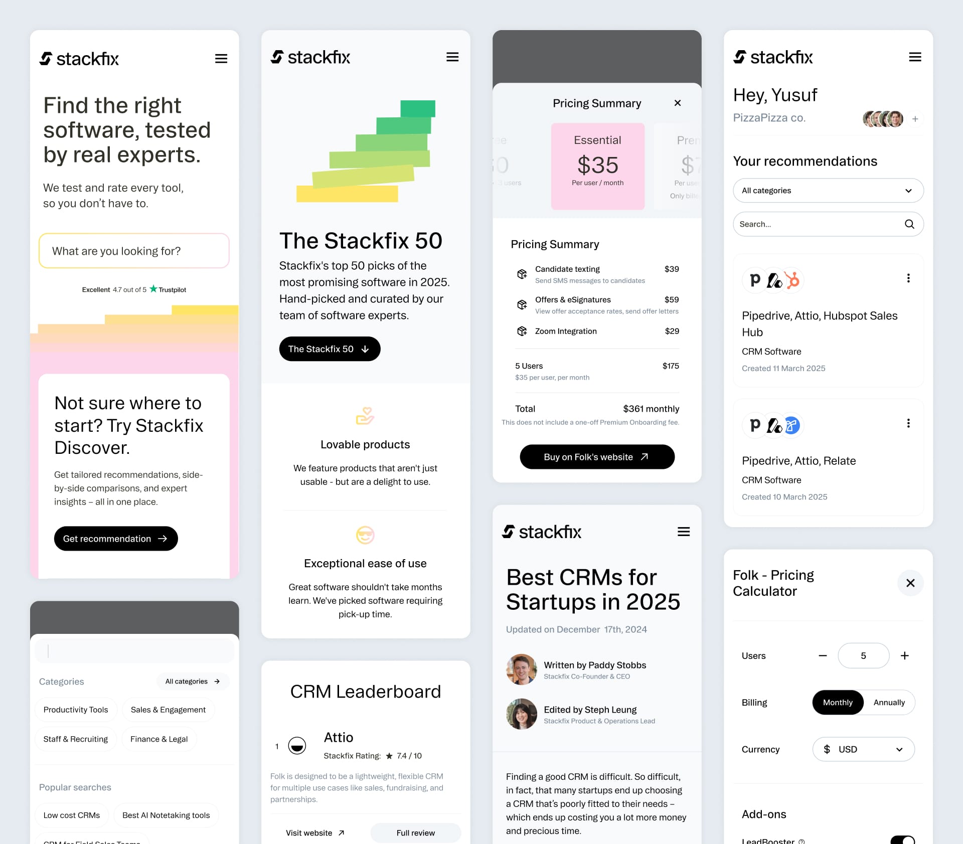
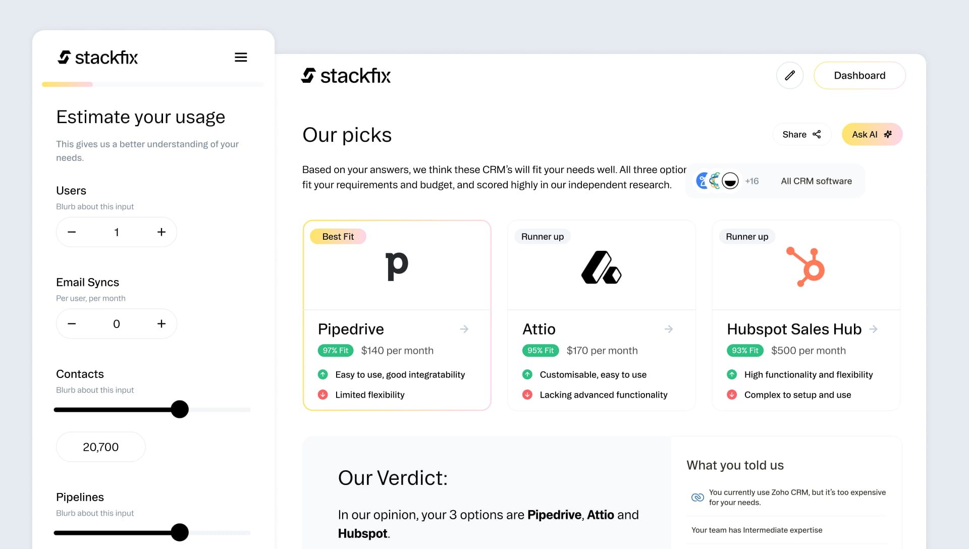
As part of our experimentation, we introduced more ways of assisting users at every step of their journey; Blog style "best for" pages to give users a jumping off point, a quiz to guide users and help them understand their needs, and a calculator to make sure they're getting the best deal.
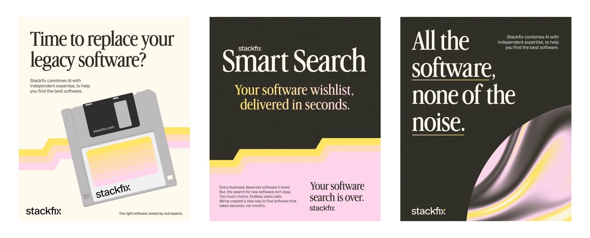
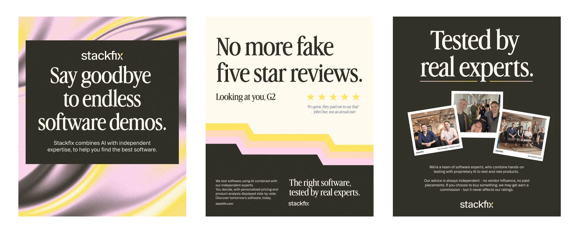
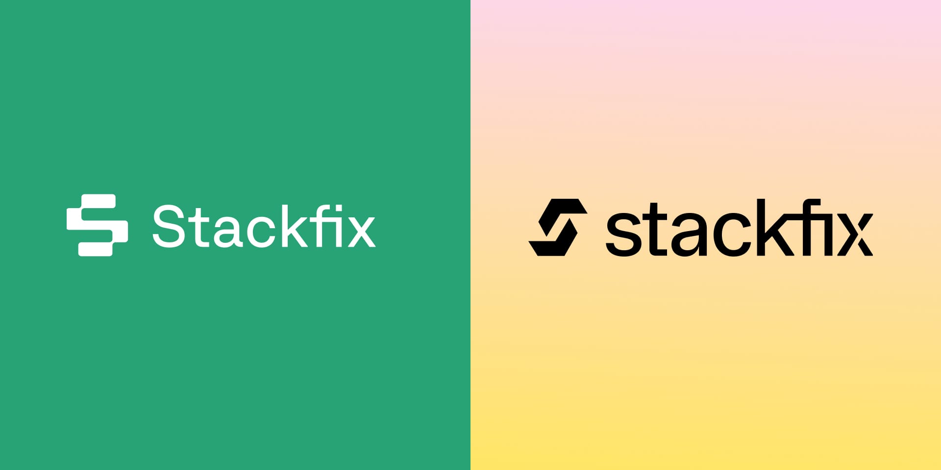
The reimagined brand was working well, but to make things more attention-grabbing we considered different approaches and adjustments. Where we landed was a retro style, reminiscent of 80's technology marketing; juxtaposing a vintage look with the future of software discovery.